[box type=”note”]Caution! View at your own risk if you are prone to seizures.[/box]
I wanted a quick project to test out a how Adobe Edge Animate can work with flexible design and therefore responsive design. With the release of Edge Animate CC, it was the perfect opportunity to explore the new features and create something different from my norm.
I didn’t use any of the new features (that I know of) in my project, but I was still able to explore them and think where I might use them later.
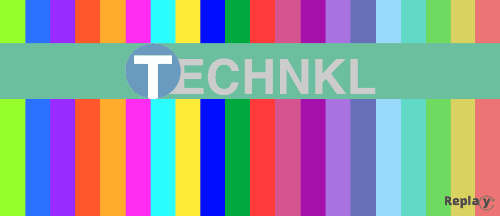
Here’s what I came up with for my simple yet colorfully active animation:
All images are SVG so they are small (just a few Kb) and can resize without loss of quality. The only exception to that is the replay button which has some odd spacing in the letters on iOS, looks great in Chrome though (on the computer).
The animation can be opened on any device that supports HTML5 and will show in the same proportions. It will look different but in essence it’s the same. Each color bar is 5% of the width of the window no matter how you stretch it.
Each color bar plays an individual timeline to transition to another color as you mouse over it, or in the case of a touch device, tap it.
I also used this fun project to get outside my comfort zone a bit on colors. I tend not to venture much into color theory or using too many colors, this sometimes leads to somewhat drab designs. Hopefully by going the extreme, not with any particular sense though, I might break that habit.
I did not get the color palette idea from this website though.
If you have any feedback or questions about this project I’d love to hear them, or answer them.
[box type=”info” style=”rounded” border=”full”]Type this into your device browser: http://goo.gl/BU9Kg (case-sensitive).[/box]
